Welcome To My Blog!

Basic and Advance Photoshop tutorials, Illustrator tutorials, tips and tricks for effective graphic designs, and other how-to guides.

Search This Blog

Wednesday, April 18, 2012

Simple Abstract Text Titles With Photoshop

The Abstract Style in text is a mainstream way of displaying your print titles. From postcards, posters to brochures, magazines and catalogs, you will always see a couple of these designs sporting creative wild styled abstract titles to draw readers in and make the printed artwork look a lot more distinct.

If you want to try your hand on creating your own creative abstract text, then read the steps below. This should give you all the necessary instructions in creating your own abstract titles easily. Just try it out in your own Photoshop.
  1. The first thing you will need to do is of course to create your new document. Size it as you need it. Set the resolution to 300ppi though, especially if you are going to use this graphic for your printed materials. To create a new document in Adobe Photoshop, simply press CTRL+N.


  2. The next thing you will want to do is to setup your background. You can either create your own background or copy/paste a special graphic from the Internet. For our purposes we have pasted in a nice red grunge background for the design.


  3. Now, type in your title text. Choose any font style you may like, however it is recommended that you do choose something that has thick character styles so that everyone can see the abstract design style created unto the text. Color your text white for now so that it is easier to see on our grunge background.


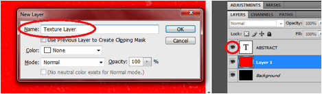
  4. Now, select the area of your text by clicking on its picture Thumbnail.


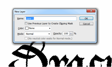
  5. Create a new layer by pressing CTRL+SHIFT+N. Name it as your texture layer. Afterwards, click on the ÒeyeÓ icon of your original text to make it invisible. NOTE, that your selection area should still remain on the canvass or work area.


  6. Before we create our texture, first setup your foreground and background colors. You will want to choose a light color on the foreground and a darker color on the background. Make sure that you match these colors with your background of course.


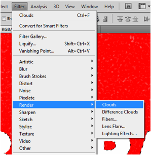
  7. Once done choosing colors, select your texture layer and then go to Filter -> Render -> Clouds. Afterwards, deselect our area by pressing CTRL+D.


  8. That should give you a cloudy look in our text. The next filter we will apply is the fiber filter. Go to Filter -> Render -> Fibers . This will apply the fiber filter to our initial cloud filter. Set the variance value to 20 and the strength to 5.


  9. Afterwards, we apply another filter. Go to Filter -> Artistic -> Watercolor. When the filter gallery opens, change the values for our palette knife to these settings: a. Brush Detail: 25 b. Shadow Intensity: 3 c. Texture: 3


  10. Now we have our grunge abstract texture. We will add in some extra layer styles. To do this, just right click on our texture layer and click on the item ÒBlending OptionsÓ.


  11. The layer styles window should open. In this window, first click on the drop shadow checkbox. Then apply these values to the drop shadow properties. a. Opacity: 40% b. Distance: 5 c. Spread: 10 d. Size: 10


  12. Then, click on the Bevel and Emboss checkbox. Apply these values to its settings. a. Depth: 800% b. Size: 1 c. Soften: 0 d. Gloss Contour: Shallow Slope Valleys, Anti- Aliased


  13. Finally, click on the Contour checkbox. Click on the anti-aliased option, and then set the range to 50%.


  14. Once done, you should have a fairly nice abstract text texture applicable to your grunge texture. Just vary the font styles, colors as well as the values in the filters we applied earlier to get different kinds of effects. Just experiment. Good Luck!


For more tips and tricks on Graphics Design, check out Printplace.com's tutorial section.

Monday, April 16, 2012

Create Gothic Bloody Text in Photoshop

If you are into that Gothic and Vampire type theme in your designs, then this tutorial is for you. Below are the detailed and quick steps into creating a gothic and bloody type text using Adobe Photoshop. This will help you effectively design halloweed themed posters and gothic-styled postcards. So just run through the steps below and see if you can do this.

  1. Firstly, setup your new document. To maintain the high quality of your text effect, even when this is printed in posters and flyers, it is a must to use a value of 300ppi or higher in the resolution field of the new document window. Of course, set your dimensions as needed for your Photoshop Document.


  2. Now, using the text tool, type in the text for your title. Of course, since we are going for a gothic theme here, we are using Gothic styled fonts. There should be plenty of free ones on the Internet so just research. For our example, we are using the gothic font style “Bastrada-K”.


  3. Then, go to your layers view. Hold down the CTRL key and then click on the text thumbnail of your text layer. This should cause the text area of your text to be selected.


  4. Afterward, press CTRL+SHIFT+N to create a new layer. Make sure that you have not deselected our text layer though while you do this.


  5. Now, with the new layer activated, and your text area selected, use a WHITE brush tool to paint some white daubs into the text area. Make sure you use a brush that has a hardness value of 100%. This will be where our “blood” will flow down from. So you will want to place these on the bottom of the text.


  6. Press CTRL+D to deselect our text area. Now go to Image -> Image Rotation -> 90CW. This will rotate our image to the right. Once there, go to Filter -> Stylize -> Wind. In the window that opens, set the Method to WIND and the Direction from the right. Then press ok. AFTERWARDS, press CTRL+F again to apply more wind effects. (Do not worry, you will see this soon enough).


  7. Now, before we turn things bloody red and right side up again, first click on the LOCK Transparent Pixels option in the layers view.


  8. Finally, edit the fill of your layer. Just go to Edit -> Fill… In the window that opens, select Use: Color… and then use the blood red color #660000


  9. Afterwards, go to Image -> Image Rotation -> 90CCW to turn your text right side up.


  10. Now, go back and select our original black text layer. Double click on it to go to the layer styles. First click on the Bevel and Emboss options and then apply these values. a. Technique: Chisel Hard b. Depth: 307 c. Size: 5 d. Rest use default.


  11. Then, click on the gradient overlay option and then select a black and dark grey color as the gradient. Leave the rest to defaults.


  12. Once, done, you should have a great looking, gothic, bloody text. Congratulations!


Check out the tips and tricks on Graphic Design at Printplace.com

Wednesday, April 04, 2012

Create A Glossy Sphere Icon With Network Energy Bands Using Photoshop

In this special tutorial, we will teach you how you can create a glossy sphere icon with network energy bands using Adobe Photoshop. This design is reminiscent of computer icons that depict the Internet, or at least a dynamic hub network. If you need that modern representation for your poster printing and postcard printing designs, then the instructions below are what you need. We will cover here how you can create your own customized glossy sphere icon and insert in the eye catching network energy bands inside them. So just follow the steps below and learn.

  1. First start creating a new document. If you are creating a real icon, using the dimensions 256x256 should be a good start. However, if you are creating a graphic for printed materials, then it is recommended that you go for higher dimensions of around 1000x1000. Set the resolution to a higher level as well (about 300ppi) to make sure the design is print worthy.

  2. Once our work area is ready, use the Ellipse tool to create your spherical shape. It does not have to be a perfect circle. For our purposes we are going to elongate our ellipse a bit so that we can emphasize the shape with lighting and shadows later. However, you can hold down the shift key while inscribing your ellipse if you want to have a perfect circle. Of course, color your circle the way you want.

  3. Next, double click on our new circle layer. This gives you access to the layer styles and blending options for this layer. Once you see the window, first click on the checkbox for Gradient Overlay. Click on the name of this option to see all of its settings. Use the settings below to get a convincing sphere look for our circle. a. Blend Mode: Normal b. Opacity: 100% c. Gradient Color: Light Blue -> Blue d. Style: Radial e. Align With Layer Checkbox: UNCHECK and then move your mouse over the circle, you will see the mouse cursor change to a move cursor, move the lighter spot of the gradient color near the bottom of the circle to simulate the sphere better. f. Angle: 90 degrees g. Scale: 100%


  4. Also, click on the ÒInner ShadowÓ option in the layer styles. This adds a darker shadow for our sphere. Apply these settings for its options. a. Blend Mode: Multiply b. Opacity: 75% c. Angle: 90 degrees d. Distance: 12px e. Choke: 0 f. Size: 50px (varies depending on the size of your circle, just look at the preview and see what looks best.)

  5. Great! Now we have a nice sphere, almost like a planet. We will now add some more subtle lighting options. To do this, duplicate our current circle by pressing CTRL+J. Clear the layer styles there my right clicking on the new layer and selecting ÒClear layer stylesÓ.


  6. Next, double click on the new layer to get into its own blending style. First in the primary blending options, reduce the fill opacity to 0%


  7. Next, click on the ÒInner GlowÓ options. Use these settings for the Inner glow. a. Blend Mode: Screen b. Opacity: 50% c. Choke: 0% d. Size: 15px


  8. Now, we will add a shadow at the bottom of our sphere. Just create a new black circle at the bottom part of your new sphere. Move this layer behind our sphere layers. Turn this into a smart object by right clicking on it and selecting the option to Òconvert to smart object.


  9. Next, go to Filter -> Blur -> Motion Blur to apply some blurring of the shadow. Use a 73 pixel value on the window that opens.


  10. Next, go to Filters -> Blur -> Gaussian Blur. Use a 20 pixel value on the Gaussian blur effect to simulate a good looking sphere shadow.


  11. Then, we will add a final highlight. Using the ellipse tool again create a white oval at the center of your circle. Then access its blending options or layer options and then apply a gradient overlay that goes from white to transparent. Finally position your highlight layer accordingly at the top of our sphere.


  12. Finally duplicate this white oval layer and then press CTRL+T to squeeze the duplicate layer quite a bit to make it look like the picture below. Once done, click on both layers and convert them to a smart object.


  13. Finally, with the smart object selected, go to Filter -> Blur -> Gaussian Blur and use a 20pixel value for the shape.


  14. Now, to add the network energy lines simply create an ellipse on the center of our sphere. Go to its blending options and first remove its fill by adjusting it to 0%.


  15. Now, tick on the checkbox for stroke. Add a 4 pixel white stroke to our ellipse.


  16. Then, click on outer glow, and apply a 10 value to both spread and size.


  17. Then tick off the inner glow option and use a 10 size value as well there.


  18. Now, convert our ellipse to a smart object by right clicking on it and selecting convert to smart object. Duplicate this layer as a backup. Afterwards use the eraser tool with a 0% hardness to erase the left side of the ellipse. If they ask to rasterize the shape, say ok.


  19. Then, just duplicate the curve you made and rotate it to apply it to different places in the sphere.


  20. Finally, we make the nodes glow. To do this, simple create a small circle for each of the nodes using the ellipse tool. For each circle convert it to a smart object and then a Gaussian blur (Filter -> Blur -> Gaussian Blur). Just adjust the pixel blur radius depending on how intense you want those nodes to be.


  21. Great! Now you have a nice glossy sphere with network energy nodes. This is perfect if you want to create a specialized globe graphic or network representation.


Visit this site, Printplace.com, to read more about Graphic Design Tutorials.

Tuesday, April 03, 2012

How To Create A Glossy Red Apple With A Bite Using Photoshop


Need a stylish Apple icon with web 2.0 elements for your poster or booklet cover design? Well, this tutorial will show you the key steps on how exactly to do it using Adobe Photoshop. We will create something almost akin to the Apple company logo, but of course fully customizable for your own poster printing and postcard printing projects. Just make sure you read carefully so that you do not miss a step. Let us start.
1.     First setup the right background for our apple. Light and neutral colours would be a good thing for our apple to stand out. So for this example, we have set a nice light green and white gradient background. Simply use the gradient tool and adjust the colours to achieve this.

2.     Now, first we draw an apple. To do this, simply use the Ellipse tool to draw a circle first. For our purposes, we have created a red circle. Now, add two anchor points on the left and right side of the top anchor point of the circle. You can do this by using the ÒAdd Anchor Point ToolÓ on top of the text tool. Do the same anchor points for the bottom.

3.     Next move your top and bottom anchor points to create our apple shape.

4.     Next, use the ellipse tool to cut out a bite in our apple shape. To do this, you just need to hold the ALT key first whilst dragging the ellipse tool on top of our apple shape. You should see then a minus cursor sign appear and of course the shape below being cut according to what you inscribe.
5.     Great! With our shape all setup. We now go to the styling of the apple shape itself. To access the layer styles and blending options simply double click on our apple shape. In the window that opens, first click on the blending options and set your fill to 0%.

6.     Next, click on the option for inner shadow. Then, apply these settings.
a.     Blend Mode: Multiply, Color Dark Red
b.     Opacity: 50%
c.     Angle: 118 degrees
d.     Distance: 5px
e.     Choke: 0
f.      Size 18px
7.     Now, click on the inner glow option. Use the values here for the settings:
a.     Blend Mode: Normal
b.     Opacity: 52%
c.     Colour: Light Red
d.     Elements Size: 40px
e.     Quality Range: 50%
f.      Rest default

8.     Finally add a gradient overlay by clicking on its checkbox. Use a red and dark red gradient overlay by editing the gradient colours. Just click on the gradient box and edit as needed. Use the default values for the rest of the gradient options. If you think though your colours are reversed, simply click on the reverse tick box.

9.     Finally, add a 1 pixel red stroke by clicking on the stroke layer style and adding the appropriate values.
10.  Great, now we have an apple shape with some great shadow and gloss effects.

11.  Now, using the pen tool, create the leaf.  It should have four anchor points.

12.  Then, use all the same blending options that we used for the apple shape.  (Right click on the original layer and choose copy layer style. Then paste it to the leaf layer.)This time tough change all the red values to green. So all dark red settings will become dark green settings, and the same for the light reds and plain red valued. Convert them all to their green counterparts.

13.  Also you may add a part of the stalk. Again use the pen tool to use this. Paste the apply layer style to this too, and of course change the colour base values from red to brown.

14.  Great! Now you have a nice glossy apple with bite mark. Congratulations!


 Check out Printplace.com's tips and tricks section for more graphic design tutorials...

Popular Posts