Welcome To My Blog!

Basic and Advance Photoshop tutorials, Illustrator tutorials, tips and tricks for effective graphic designs, and other how-to guides.

Search This Blog

Thursday, March 29, 2012

Photoshop Tricks: Grunge Colourful Spray Paint Text Effect

Welcome to this Adobe Photoshop tutorial for text effects. In this feature we will go through the steps in creating a grunge and colourful type spray paint text effects. It is fairly easy to do this with the right font and of course a flair for randomness and abstract beauty. You can use this for specialized typographical design themes for magazine covers, postcard prints, booklet titles, poster printing headlines and a lot more creative design persons both in print and in the web. Of course, you will need some basic understanding of Photoshop to do this. Just read the steps carefully though and you should learn all the basic things you will want to understand.

  1. First setup your new document in Adobe Photoshop as you need. It would be good to be aware of the resolution here as most designs for print need a value of 300ppi or higher, while web designs only need about 72ppi. Just set according to your end goal. For our example, our new document will have a background color of black.

  2. To setup our grunge spray painted background, create a new layer by pressing CTRL+SHIFT+N. Name this layer as you see fit and then just apply some random creative spray paint brushes. Use white color for now.

  3. Next, double click on our spray paint layer to get to its blending and layer style options. Click on the option for the Outer Glow. Apply these values here: a. Blend Mode: Screen b. Opacity: 75% c. Noise: 0% d. Technique: Softer e. Spread: 0% f. Size: 180px g. Rest use defaults.


  4. Depending on the effect of your spray paint, you can already accept the effect that happened, or adjust it further. Once you deem that your spray pain effect is finalized, you should now flatten this layer. Just right click on the spray paint layer and click on “convert smart object”. This effect should give us the functionality that we need.

  5. Now, look for a good background for your spray paint layer. This can be a grunge type concrete wall, sandy textures, rock textures or something weathered. Paste it on top of our sprain paint layer. Then, add a clipping mask by right clicking on the pasted layer and selecting the option to “create clipping mask”. If the texture you chose is too overpowering, try reducing the opacity of this clipping mask layer to 50%.


  6. We now have a good spray painted background, now we shall add the text. Try to use a more naturally flowing grunge font style for your choice so that it looks more convincingly like spray paint. Using that font, just type in the message that you need for your title or design.


  7. Duplicate the text layer by pressing CTRL+J. Alternatively, you can right click on the text layer and choose “duplicate layer...” Hide the duplicate as this will be your backup. Use this as your main backup just in case you screw up with the other tricks.


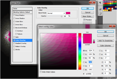
  8. Now using the first visible text layer. Go to the blending options for this layer by double clicking on it. Tick on the color overlay option and then choose a color that you need for the TEXT of your design. Switch the opacity value to 100% and use a normal blending mode. Press OK once done.


  9. Afterward, with the text layer still selected, go to Effects -> Blur -> Gaussian Blur. They will ask if you want to rasterize the layer. Select yes to continue. (take note that you cannot edit the text once you do this, so make sure you are sure about your text. Use a 13px value for the Gaussian blur effect.


  10. Create a new layer again (CTRL+SHIFT+N) and then use a 0% hardness brush (of a size you choose) to add more random spray pans around our blurry text. Use a different color here than the text.


  11. Next, duplicate our hidden text layer before and unhide this new layer. Add a Gaussian blur effect to this as well. Rasterize this layer of course for this to happen. Use a 5px blur here. The white color should be ok here, but use the color that you need for your title.


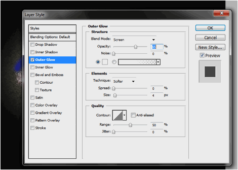
  12. Then duplicate the text layer AGAIN, and then apply several blending options. First tick of the Outer Glow option and apply these values. a. Blend Mode: Screen b. Opacity: 65% c. Glow Color: White d. Technique: Softer e. Spread: 0% f. Size: 4px g. Range: 50%


  13. Tick on the Inner glow option as well and apply these settings: a. Blend Mode: Screen b. Opacity: 75% c. Glow Color: DEFAULT d. Technique: Softer e. Spread: 0% f. Size: 6px g. Range: 50%


  14. Check the Color overlay setting and use a grey overlay color. Use a blend mode of normal and opacity of 100%. Press OK once done.


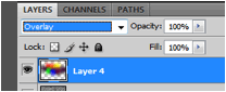
  15. Now, duplicate our texture layer earlier (the concrete, sand or rock weathered layer). Move its duplicate to the top. Then go to its blending options and set its opacity to 30%. Change the blend mode to multiply as well.


  16. Great now we have the basic spray paint type text with spray painted background.


  17. Let us add a more dynamic color to the proceedings. Create a new layer on top and add a few large brush spots with different colors.


  18. Apply a Gaussian blur to these spots (around 50px).


  19. Afterwards, go to the blending options on this layer and select a blend mode of Overlay.


  20. Now you have a great and interesting looking spray painted type text with colors.


Friday, March 23, 2012

Easy Steps To Creating A Mail Envelope Icon In Illustrator

So you need a custom mail envelope icon in illustrator? Well, you have come to the right place. We will teach you here how to create a simple but styling mail envelope icon or vector graphic that you can use for your various business or commercial prints. From the covers of your catalogues to your poster prints and postcard prints, these mail icons should come in handy when you want to convey the message of being able to be contacted through snail mail, or even email actually. So just follow the simple tips below and discover.

  1. Fire up your Adobe Illustrator and then choose the appropriate document size.

  2. First, create a rectangle. Just choose the rectangle tool in the tools window.

  3. Then just click and drag the tool over the canvass to get your rectangle.


  4. Now, we’ll colour up this base to make it look like an envelope. First change its stroke colour, something grey would be appropriate. Just choose this from the gradient controls on the right.

  5. Then we’ll chose a gradient base. Just click on the gradient colours, and choose white and grey as the gradient bases for the spectrum. Set the type of gradient to radial.


  6. Now we have the base for our envelope..


  7. Next, we use the pen tool. Choose it from the tools window. (Shortcut P)


  8. Now, draw a path of the fold triangle above the envelope base.


  9. Next, select the Add Anchor Point tool.


  10. Add two anchor points, both midway between the intersecting lines in the middle of the envelope.


  11. Next, select the Convert Anchor Point tool.


  12. Select the middle anchor point and adjust it so that the hard point becomes a nice round edge.


  13. Now, select the direct selection tool and click on our flap.


  14. Press CTRL+C and CTRL+V to copy and paste the flap. Add the copy a few pixels below the original flap.


  15. Change it to a darker grey colour.


  16. Then send this to the back. Just right click on the shape, and then select arrange -> send backward.


  17. Now we have a flap and a shadow.


  18. Make sure of course that the stroke weight is at 0px for this duplicate of the flap to make it look like a shadow.


  19. Next, use the line tool to draw the bottom fold and edge of the envelope. Make sure that this one has a stroke of at least 1px.


  20. Send this to the back as well.


  21. Then just repeat the process for the other fold and edge. Send this to the back as well.


  22. Great! Now we have a convincing looking envelope Icon.


Visit this site, Printplace.com, to read more about Graphic Design Tutorials.

Wednesday, March 14, 2012

Photoshop Tutorial: Drawing A Videogame Mushroom Icon

Welcome to this Photoshop tutorial about creating a popular videogame mushroom icon. Here you will learn the easy step by step instructions on how to create the mushroom graphic straight from the popular Mario videogame. The neat thing about this is that once you learn how to do it, you can then customize the colors and shapes as you see fit. So you can apply these to your own flyers, poster prints and even greeting card prints easily. Just carefully read the steps below

  1. First, setup your new document. The key important factor here is the resolution. For print graphics, it is essential that you use higher values for the resolution field. So when creating a new document, make sure you put in a value of 300ppi or higher. Take note that this will take up a lot more resources though. Once you have set this and the dimensions that you need, press OK.

  2. Setup a dark background for your canvass using the pain bucket tool to fill it with black. This will help you see our mushroom icon better. Then press CTRL+SHIFT+N to create a new layer for our icon. Afterward, use the pen tool to create the initial top mushroom shape. In our mushroom shape, we use one anchor point on top, one each on both sides, and then three at the bottom to create the shape you see.


  3. Now, fill your new shape with a red color. In the paths panel, right click on your work path and then select the option to “Make Selection”. Choose a red color for your mushroom and then use the paint bucket tool inside your shape to add the color.

  4. Now, go to the blending options of your new layer by double clicking on the layer name itself. Once in the Blending options window, click on the checkbox for gradient overlay. Use a red, darker red, and red gradient with a 90 degree angle just like you see below.


  5. Now we will add the additional white spots. Create a new layer and then change your foreground color to white. Using the elliptical marquee tool to create a round area in the mushroom shape. Fill it with a light grey color (f4f4f4).


  6. Next use the Burn tool to darken the bottom areas of our round shape, while use the Dodge tool to lighten the top areas.


  7. Duplicate the same process with a few more other spots. Do not worry about the circles going across the mushroom shape for now.


  8. Next, go back to your paths panel, and click on your original work path. Right click on it and click on “make selection...”


  9. Then, just select a 0 pixel feather radius on the window that opens. Once you press ok, you will see the outside of the shape of our mushroom is selected. Now, erase the overhanging white circle shapes to leave the original shape behind with the white spots. Just use a hard eraser brush type to do this.


  10. Now, create a new layer and then use the elliptical marquee too to create the bottom face part of our mushroom icon. Fill this one white a very light grey color as well.


  11. Use the burn tool on the edges of the shape, while should use the dodge tool on the center to get the right face composition.


  12. Now, use the rectangle tool to create a new thin rectangle shape like this.


  13. Now, press CTRL+T and then warp the rectangle a bit like so. Do this by right clicking on the rectangle after pressing CTRL+T and choosing the warp option in the context menu.


  14. Then, simply duplicate the layer by right clicking on your original rectangle layer and selecting the option to duplicate the layer. Afterwards, press CTRL+T on that duplicate shape, and the right click on it. Click on the option to flip horizontal and then place your other mushroom eye in the appropriate place.


  15. Great! That gives us our mushroom icon! Now you can change the colors easily for your custom designs.


Visit this site, Printplace.com, to read more about Graphic Design Tutorials.

Popular Posts