Welcome To My Blog!

Basic and Advance Photoshop tutorials, Illustrator tutorials, tips and tricks for effective graphic designs, and other how-to guides.

Search This Blog

Tuesday, September 10, 2013

Creating A Simple Godfather Type Design

In this guide, you will learn the simple steps in making a simple "Godfather" like design in Adobe Photoshop perfect for posters or print flyers. The steps are pretty simple, so even a beginner should be able to easily handle it. So do not worry about needing the right skills. Just follow the items and steps listed below and you should not get lost. So let us get started.

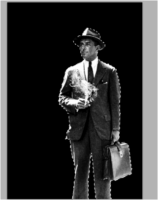
  1. First, we will want to get a good picture of our main figure or model. Here we are using a picture of a man in a suit. It is a bit dated, but that is fine as the look we are going for has that black and white theme of the Godfather of course. Now, we process this image by removing its background. We used a mix of the magnetic lasso tool and the magic wand tool to select the figure of the model.


  2. Next, we simply copy the area we selected and pasted it back as its own layer. To make it look better though, we adjusted brightness and contrast. Just go to Image -> Brightness -> Contrast and just adjust the dials until the image looks well toned.


  3. Adjustments -> Curves and then adjust the curve graph a little bit like what you see below. It does not have to be exactly like the curve, just make sure that you see the details of our image better. This will vary of course depending on what kind of image you are working with.


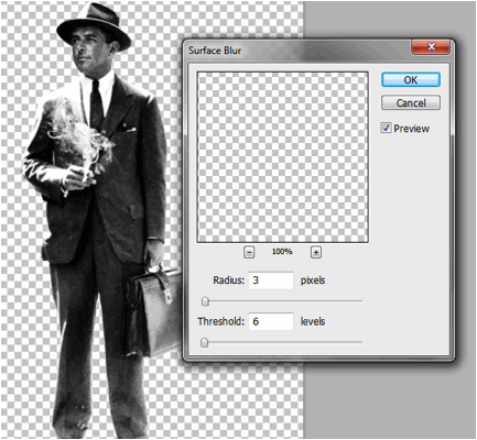
  4. Finally, before we actually create the poster document, we blur our image just a bit. This should help hide some of the imperfections in our cut, while at the same time smoothing out the overall shape. Just go to filter -> blur -> Surface Blur. Use a 3 value for the radius and a 6 value for the threshold.


  5. Great! Now, we will create our poster document. Just press CTRL+N to create a new document. Set your dimensions to the correct poster size that you want. Also use a high resolution value that is appropriate for printing. Here we are creating an 11x17 inch poster at 300ppi resolution.


  6. Once open, we set the background to black and then paste in our model. Here we scaled it up a bit by pressing CTRL+T and then transforming it to scale (hold down the SHIFT key). We also positioned it a bit off center with the feet hidden as we are going to be placing in some design elements around our figure of course.


  7. Now, looking at our image, the darks are not dark enough for our effect. So with the pasted layer selected we go to Image -> Adjustments -> Selective ColorÉ In the Colors drop down menu select ÒBlackÓ and boost the black slider to 100%.


  8. Then select the Whites, and adjust the black value to -100%.


  9. Next, we will add a Photo Filter. Go to Image -> Adjustments -> Photo FilterÉ We picked ÒColorÓ as the filter to use. We chose a washed our red color at 30% density. Of course, you can change this to any color your theme needs. For our purposes this will accent the tie color that we are going to change.


  10. Now, we are going to apply a couple of more filters. First go to Filter -> Blur -> Gaussian Blur. Use a 5 pixel Gaussian blur. Now do not be alarmed with have a too fuzzy image. Once done, go to Edit -> Fade Gaussian BlurÉ In the window that opens, adjust the Opacity to 30% and use the "Linear Light" option as the blend mode.


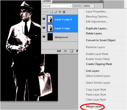
  11. Duplicate our layer by pressing CTRL+J. Next with the duplicate selected, go to Filter -> Brush Strokes -> Angled Strokes. Use the values below for the settings. a. Direction Balance: 77 b. Stroke Length: 8 c. Sharpness: 2


  12. Afterwards, change the opacity of this layer to 80%. You will see the angle stroke filter get applied in a subtle creative pattern over the original image. Once you see the effect, select both layers and merge them by right clicking on it and selecting "merge layers".


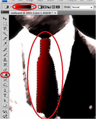
  13. Next, using the Pen tool, trace out the tie of our model, then right click on it and make a selection.


  14. Next, create a new layer by pressing CTRL+SHIFT+N. With this new layer set and the tie shape selected, fill the area with a gradient color that goes from red to Black.


  15. Next, we will apply some filters to the tie to make it more integrated. First go to Filter -> Noise -> Add Noise. Use a 3% value.


  16. Then, go to Filter -> Brush Strokes -> Angled StrokesÉ Then just use the same values as what we used in the main image. a. Direction Balance 77 b. Stroke Length: 8 c. Sharpness 2


  17. Then, we just reduce the opacity of our Tie a bit to make it look more integrated.


  18. Great! Now, using some simple white Mafia-inspired font styles, we place in our poster title in the design.


  19. Now, using the line tool create a 1px line border at the bottom left of our poster design. Add a layer mask by clicking on the layer mask button in the Layers panel. Then use a large soft brush to softly erase the edges to add the effect below.


  20. As the final piece of the design, we paste in a picture of various mob ÒvicesÓ just on top of the black background. We reduce its opacity to just around 10%.


  21. Now we have finished our Godfather style color poster design. Congratulations!


For more tips and tricks on Graphics Design, check out Printplace.com's tutorial section.

Tuesday, March 19, 2013

Creating Your Own Heavy Metal Styled Posters With Photoshop

Do you need a more grungy and heavy metal style for your posters? Besides just pasting in random metal textures, there are a lot of ways that you can add that grungy metallic style. Here in this tutorial we will talk about not only putting metal textures into a poster. We will also discuss how you can turn your text styles into metal and integrate them creatively unto metal textures. So if you want to learn how to create your own heavy metal styled posters, here is the guide for you.

  1. The first step is to set your poster dimensions. Here is where some people get things wrong as they only look at the dimensions. While you can easily set the dimensions (width and height), many people pass over the resolution value. The resolution is important as it will determine the real quality of the design in printing posters. A minimum of 300ppi is recommended in fact for the best results. So once you create a new document in Adobe Photoshop, make sure that you set at least this value for your resolution, along with the poster dimensions that you want.


  2. With your new document open, the first step is to write your poster title. This will be the main feature of our heavy metal style poster. Just use Photoshop's text tool to write your desired title. Use a black color for your text for now and of course, choose a font style that matches your theme.


  3. Also, while this is not actually required, it is good to reduce the spacing or tracking within the characters. You can do this through the characters panel. If you do not see this, go to Windows->Character in the menu bar. Alternatively you can select a group of text and press CTRL+T to bring this up. Simply change the tracking value (AV icon) to something negative to bring the text closer together. Note that you can also change a lot of the text attributes in this panel. Play around!


  4. Now, we will create a metal feel for the text we just did. First, create a new group for our metal effect. Just click on the "Create New Group" icon in the layers panel. Name the group to label it appropriately as the layer to make our text look like metal. Here we named it "textmetal"


  5. Now, with our group layer selected, active the rectangular shape tool and inscribe a rectangle shape over part of our text. Do not worry if it goes out of the bounds of the text. Just make sure of course it is relatively covering the text properly. Note that once you let go of the shape tool, it automatically produces a shape layer within our newly created group. Use a grey color here (#333333).


  6. Now, keep creating more rectangles and squares. Think of these shapes as metal plates. Do not worry about going out of bounds of the letters, we will fix this soon enough. Just make sure you place in those rectangles as if they were plates. Follow the contour of the text when possible.


  7. Now, we are going to place in layer styles. Double click on one of your rectangle layer shapes. The layer styles window should open. We will be adding 4 types of layer styles or blending options. The first is the Drop Shadow. Click on this option. Adjust some of its values as follows: a. Opacity: 75% b. Distance: 0px c. Size: 13px d. Rest should be default.


  8. Then, click on the option ÒInner ShadowÓ. Change the values for this style like so: a. Opacity: 75% b. Distance 0px c. Size: 54px


  9. Now, click on ÒBevel and EmbossÓ. This helps make the shape look protruded or embossed of course. Change the following values: a. Depth: 1000% b. Size: 2 c. Rest should be default


  10. Then, add a gradient overlay by clicking on its checkbox. Change the parameters for this style as follows: a. Blend Mode: Screen b. Opacity: 15% c. Gradient Black to White. Check the box to reverse d. Style: Radial e. Rest should be default.


  11. You should see the effect get done in just ONE of our rectangles. To start apply them to all quickly, first right click on our layer and select the option to "copy layer style".


  12. Now, select all the rest of our rectangle shapes. Right click on them to bring up the context menu and then choose "Paste Layer Style". You should then be able to apply the metal plate initial style to all our rectangles.


  13. Great! Now we will shape those plates so that they only appear in the bounds of the text. To do this, first hold down the CTRL key and click on the layer thumbnail of our text. Here we are doing this for the ROCK text. You will see the area of the text get selected. Once you see the "marching ants" in the shape of the text, click on the layer group for text metal.


  14. Then, go to Layers -> Layer Mask -> Reveal selection.


  15. You should then see the plates get inscribed only in the selected area in the shape of the text. Repeat the process for all the text that you need.


  16. Now, we want to merge the groups. Just right click on the group folder and select "Merge Group". Of course make sure you already like the positions of the metal plates before you do this.


  17. Then, double click on the merged layers one by one. Apply the same Bevel and Emboss layer style settings that we used for the metal plates on these layers. This should make our text look more integrated.


  18. We are not yet done though. Those metal plates needs some "rivets" to make them look constructed together. To do this we create a new Group named rivets. Then using the Elliptical Shape Tool we draw in a very small light grey circle on one side of the plates. The size really depends on how big your design is. The key thing though is that you must hold the SHIFT key as you inscribe the circle so that the dimensions are constrained and you get a perfect circle for the rivet. Here we used a light grey (#999999) color.


  19. Now, before we multip7e the rivets, we will first add a couple of layer styles to it like the metal plates before. So double click on the this first rivet layer to get to the layer styles window. The first thing that you will want to apply is a drop shadow. Click on the checkbox and set these values. a. Distance: 0px b. Size: 5px


  20. Then click on Bevel and Emboss. Change the attributes of these values: a. Depth: 50% b. Size: 0px c. Highlight Mode Opacity: 100% d. Shadow Mode Opacity: 100%


  21. Finally, click on the Gradient Overlay. Use these values for the settings. a. Opacity: 40% b. Gradient Color: Black-to-White c. Style: Radial d. Angle: 90 degrees e. Scale: 135%


  22. Once done, zoom out and you will see the look of the rivet like this.


  23. Now, all you have to do is to duplicate this rivet for all our metal plates. To make the process easier, you can just use the ALT key. Simply press and hold the ALT key to quickly duplicate the rivets several times and place them appropriately on the corners of the plates.


  24. After some patient effort, you should have something like this. Once you are happy with the placement of the rivets merge the groups just like what we did with the metal plates.


  25. Now, to start fully realizing our design, we paste in a metal texture for the background.


  26. Now, we will match the color of our texture a bit with our text. There are many ways to do this, but to make things easier and just tone down some of the more intense colors in our texture, we just use a Photo Filter adjustment. Do this by going to Image -> Adjustments -> Photo Filter. Use a black color at 80% density.


  27. Now, we are going to merge our title layers into one layer so that we can apply an integrated effect to them. So select all our rivet layers and the metal plate layers and then right click on them. In the menu that opens, click on "merge layers".


  28. Double click on this new merged layer to bring up its layer style. Tick on the option for Bevel and Emboss. We are going to make the text look embedded in our grungy metal layer. Set these settings for the Bevel and emboss. a. Style: Pillow Emboss b. Depth: 1000% c. Size: 10px d. Soften: 1px


  29. You should now have this kind of effect:


  30. Now, we will add a few finishing touches. Create a new layer by pressing CTRL+SHIFT+N. Then using some grunge spray paint brushes, we place in several splatters around our title and the poster. Once set, we change the blend mode of the spray paint layer to ÒOverlayÓ to make the spray paint effect look better unto the metal.


  31. Lastly, go to Layers -> New Adjustment Layer -> Gradient MapÉ Set the gradient color map to purple-yellow.


  32. Finally, reduce the opacity of the adjustment layer to 30%.


  33. Great! Now we have our grungy heavy metal style poster! Note that you can add of course any other text layers below the adjustment later for other poster details. Just customize as you see fit.


For more tips and tricks on Graphics Design, check out Printplace.com's tutorial section.

Popular Posts