Welcome To My Blog!

Basic and Advance Photoshop tutorials, Illustrator tutorials, tips and tricks for effective graphic designs, and other how-to guides.

Search This Blog

Monday, February 27, 2012

Illustrator Quick Tutorials: Creating A Vector Flower

Flowers are great accents for your graphics, header/logo designs as well as actual printed themes and design elements. In this tutorial we will teach you how to create a very simple flower design in Adobe Illustrator. This technique will be perfect for you if you need a stylish flower design for items like poster prints, postcard printing and of course other digital print media where a flower logo or theme is needed. So just follow the step by step instructions below to see how you can do it yourself.

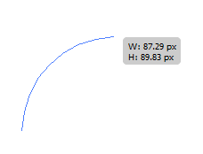
  1. Start by opening your new document and then clicking on the Arc tool.


  2. Now, draw your first Arc like so.


  3. Then, draw a second arc, this time going to the opposite direction from the top to the bottom. End the arc in the starting point of the original arc.


  4. Now, let us join those points to make the petal into a shape. Go to your tools window and click non the Direct selection tool (Shortcut A).


  5. Click and drag the selection tool on the top end points of our arc. Right click on them and select “Join”


  6. Do the same with the bottom.


  7. Next, we will duplicate the petal in a radial fashion to create our flower. Simply select the rotate tool in your tools window. Make sure of course that the petal is selected.


  8. Make sure that you drag the rotation point to the bottom intersection of end points to make the radial effect successful.


  9. Next, hold down the ALT key, and drag the petal downwards. You should see a duplicate of the petal rotate along the point or rotation, Just place it where you need it along the rotation path.


  10. Now, press CTRL+D several times to complete the radial flower pattern of our flower.


  11. Once the radial distribution is done, select a couple of petals at random. Use the SHIFT key and then just click on a couple of those petals. Right click on those selected petals and choose Arrange -> Bring to front.


  12. This gives us a more natural looking overlapping of some of the petals.


  13. Next, select the ellipse tool.


  14. Draw a circle on the centre of our flower.


  15. Great! Now we have our Flower base!


  16. All that is left for you to do is to colour up the flowers with various colour gradients.


  17. Now you know how to make easy vector flowers in Illustrator.


Visit this site, Printplace.com, to read more about Graphic Design Tutorials.

Thursday, February 23, 2012

Step By Step Guide To Creating Folder Icons In Photoshop

The folder icon is a pretty popular and useful graphic used in many types of digital designs. From your computer to your mobile devices, you can always see them, and they always convey that useful message of a place where the things you need are. Now, for custom designs either digitally or even for print such as postcard prints, poster prints or print calendars, you will want of course to have YOUR OWN folder icon or an icon of any other object for that matter. This tutorial will teach you just how to do that.

It is not that hard actually to create folder icons. Even novices in design should be able to handle it with the right instructions. In this guide, I will instruct you on how to do a folder icon step by step.  Just sit back and follow through on these instructions and you will know what to do.
  1. Open up Photoshop and create a new document. Just set the size that you need, but for our example, we are going for something big so that you can see easily. Set the resolution to 72 if you are going to use this icon in websites or as real icons. Set it to 300 if you plan on printing this on paper or other types of print surface.


  2. First, draw a simple rectangle. Choose the rectangle tool in your tool window.


  3. Click and drag the tool to the appropriate size and ratio of a folder.


  4. Next, select the rounded rectangle tool in the tools window.


  5. Now, draw a smaller rounded rectangle at the top left of the larger rectangle.


  6. Next, press CTRL+T to transform our smaller rectangle.


  7. Right click on the rectangle and choose perspective as the transform style.


  8. Move the top right anchor of the rectangle inward to get the extruded part of our folder shaped.


  9. If you think that the extruded rectangle is too large, right click on it and choose “scale” so that you can resize it in its trapezoid shape to a smaller size.


  10. Once you have the right size and shape, press enter to commit our transformation.


  11. Now, select both layers, and then right click on them. Select “Convert to Smart Object”. This should make both shape layers into one object we can manipulate.


  12. With the new smart object selected, right click on it and then click on “blending options”.


  13. Once the blending options window opens, tick on the “gradient overlay” option.


  14. Click on the gradient box to customize the colour gradient. Choose something appropriate for your theme. For our example, we are going to use a dark orange to a light orange.


  15. Tick the stroke option as well. Set the size to 1px and then the colour to a gray colour.


  16. Now, we have the basic folder design.


  17. The next step is to create the opening flay. First right click on our smart object and select “duplicate layer...” Just press OK on the window that opens.


  18. Now, press CTRL+T on this new duplicate layer and then reduce the height of it just as you see below.


  19. Next, right click on the shape and then press “Perspective”.


  20. Then, select the top left anchor of the transform box and move it outwards. This gives the effect of an open folder.


  21. Once you press enter, you should get your base for your folder.


  22. Now, let us style the folder a bit. Add a white rectangle layer in the middle of our two folder layers to make it look like something is inside.

  23. Just create a typical rectangle as usual and then slip it in between both those layers like so.


  24. Modify the blending options of the white rectangle by adding the Stroke option 1px using grey colour....


  25. Also add in a gradient overlay to make it look more dynamic. Press Ok once you’re done.


  26. Finally, rotate the white paper rectangle a bit by pressing CTRL+T and then dragging your mouse in a circle along the edges of the shape.


  27. Great! Now we have a good folder icon ready for publishing.

  28. Add an additional style if you want by bringing up the blending options of the front flap layer, and then adjusting the General Blending Options opacity by about 70%.


  29. Once done, you should have a good and sleek looking folder ready for most designs. Just alter the colours as necessary.


  30. Visit this site,
    Printplace.com, to read more about Graphic Design Tutorials.

Wednesday, February 22, 2012

Creating A Simple Cartoon Animal Face In Illustrator

Looking at many of the newest websites today, you will see that many are turning to cartoon style illustrations. This is in line with the latest sleek, bright and cartoon like trends in web and print design. Now, even for newbies, it can be easy to create a cartoon animal face custom made for their own websites and even those looking to make their flyer printing, poster printing and postcard printing pieces more interesting. Using Adobe illustrator and a few custom shapes and flourishes, you can easily achieve this yourself. Here are the steps that you can try out to get a simple cartoon animal face in illustrator.
  1. First, let us start with the face. Use the ellipse tool to draw a standard circle.

  2. Make sure that you colour it with the approximate colour that you want for your animal face.

  3. Next, select the direct selection tool in your tool window.

  4. Click the bottom anchor of your circle to start moving that side downwards without altering the top part.

  5. For this tutorial, we are going to create a bunny. So we lengthen the bottom as a snout.

  6. Then, select the top anchor and move it a bit downwards to flatten the top part of our head.

  7. Afterwards, Press CTRL+C and then CTRL+V to duplicate what we have done.

  8. Change the duplicate’s color to a lighter shade. Then make it smaller a bit using the standard selection tool. Place it back to our original shape to get a lighter face on top of the head.

  9. Next, let’s make the eyes. From the outside of the head, use the ellipse tool again to create just one eye.

  10. Next, add two more circles, in white color that are smaller. One in the center and one on the top left side.

  11. Now, select all three circles and move it as one of the eyes of our face.

  12. Press CTRL+C and then CTRL+V to duplicate the eye. Once duplicated, position it as the other eye.

  13. Now, to make a nose, simply do the same process as we did with the face, only this time, you do not need to elongate the snout too much.

  14. Then, position the nose near the base of the snout.

  15. Now, on the side of your canvass first create the ears using the ellipse too.

  16. Duplicate it, reduce its size and change its colour. Use the simple selection tool to reduce its size correctly.

  17. Now, place this on the top of our face. Press CTRL+ [ to send it to the back of the face.

  18. Duplicate the ears by pressing CTRL+C and then CTRL+V again. Position the duplicate on the other side.

  19. Now, alter the angles of the ears to make them droop down. Right click on the ear elements, click on transform -> rotate... and select 45 degrees on the left, while -45 degrees should be set for the right.

  20. Great! Now we have a nice and simple bunny face vector.

  21. Now just alter the colors and styles to your taste of course.

Visit Printplace.com to read more about Online Printing Services and Graphic Design tutorials.

Popular Posts