Welcome To My Blog!

Basic and Advance Photoshop tutorials, Illustrator tutorials, tips and tricks for effective graphic designs, and other how-to guides.

Search This Blog

Showing posts with label online printing company. Show all posts

Tuesday, September 10, 2013

Creating A Simple Godfather Type Design

In this guide, you will learn the simple steps in making a simple "Godfather" like design in Adobe Photoshop perfect for posters or print flyers. The steps are pretty simple, so even a beginner should be able to easily handle it. So do not worry about needing the right skills. Just follow the items and steps listed below and you should not get lost. So let us get started.

  1. First, we will want to get a good picture of our main figure or model. Here we are using a picture of a man in a suit. It is a bit dated, but that is fine as the look we are going for has that black and white theme of the Godfather of course. Now, we process this image by removing its background. We used a mix of the magnetic lasso tool and the magic wand tool to select the figure of the model.


  2. Next, we simply copy the area we selected and pasted it back as its own layer. To make it look better though, we adjusted brightness and contrast. Just go to Image -> Brightness -> Contrast and just adjust the dials until the image looks well toned.


  3. Adjustments -> Curves and then adjust the curve graph a little bit like what you see below. It does not have to be exactly like the curve, just make sure that you see the details of our image better. This will vary of course depending on what kind of image you are working with.


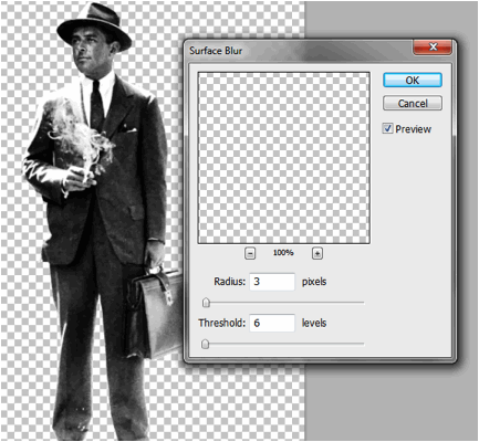
  4. Finally, before we actually create the poster document, we blur our image just a bit. This should help hide some of the imperfections in our cut, while at the same time smoothing out the overall shape. Just go to filter -> blur -> Surface Blur. Use a 3 value for the radius and a 6 value for the threshold.


  5. Great! Now, we will create our poster document. Just press CTRL+N to create a new document. Set your dimensions to the correct poster size that you want. Also use a high resolution value that is appropriate for printing. Here we are creating an 11x17 inch poster at 300ppi resolution.


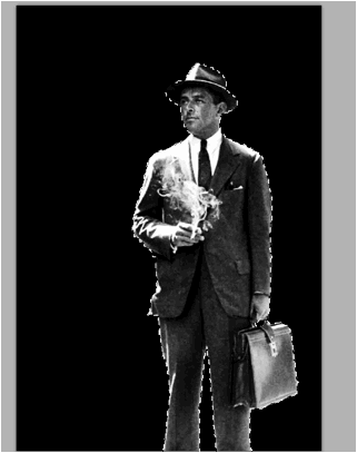
  6. Once open, we set the background to black and then paste in our model. Here we scaled it up a bit by pressing CTRL+T and then transforming it to scale (hold down the SHIFT key). We also positioned it a bit off center with the feet hidden as we are going to be placing in some design elements around our figure of course.


  7. Now, looking at our image, the darks are not dark enough for our effect. So with the pasted layer selected we go to Image -> Adjustments -> Selective ColorÉ In the Colors drop down menu select ÒBlackÓ and boost the black slider to 100%.


  8. Then select the Whites, and adjust the black value to -100%.


  9. Next, we will add a Photo Filter. Go to Image -> Adjustments -> Photo FilterÉ We picked ÒColorÓ as the filter to use. We chose a washed our red color at 30% density. Of course, you can change this to any color your theme needs. For our purposes this will accent the tie color that we are going to change.


  10. Now, we are going to apply a couple of more filters. First go to Filter -> Blur -> Gaussian Blur. Use a 5 pixel Gaussian blur. Now do not be alarmed with have a too fuzzy image. Once done, go to Edit -> Fade Gaussian BlurÉ In the window that opens, adjust the Opacity to 30% and use the "Linear Light" option as the blend mode.


  11. Duplicate our layer by pressing CTRL+J. Next with the duplicate selected, go to Filter -> Brush Strokes -> Angled Strokes. Use the values below for the settings. a. Direction Balance: 77 b. Stroke Length: 8 c. Sharpness: 2


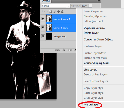
  12. Afterwards, change the opacity of this layer to 80%. You will see the angle stroke filter get applied in a subtle creative pattern over the original image. Once you see the effect, select both layers and merge them by right clicking on it and selecting "merge layers".


  13. Next, using the Pen tool, trace out the tie of our model, then right click on it and make a selection.


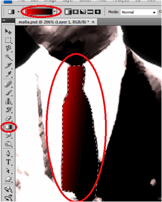
  14. Next, create a new layer by pressing CTRL+SHIFT+N. With this new layer set and the tie shape selected, fill the area with a gradient color that goes from red to Black.


  15. Next, we will apply some filters to the tie to make it more integrated. First go to Filter -> Noise -> Add Noise. Use a 3% value.


  16. Then, go to Filter -> Brush Strokes -> Angled StrokesÉ Then just use the same values as what we used in the main image. a. Direction Balance 77 b. Stroke Length: 8 c. Sharpness 2


  17. Then, we just reduce the opacity of our Tie a bit to make it look more integrated.


  18. Great! Now, using some simple white Mafia-inspired font styles, we place in our poster title in the design.


  19. Now, using the line tool create a 1px line border at the bottom left of our poster design. Add a layer mask by clicking on the layer mask button in the Layers panel. Then use a large soft brush to softly erase the edges to add the effect below.


  20. As the final piece of the design, we paste in a picture of various mob ÒvicesÓ just on top of the black background. We reduce its opacity to just around 10%.


  21. Now we have finished our Godfather style color poster design. Congratulations!


For more tips and tricks on Graphics Design, check out Printplace.com's tutorial section.

Thursday, August 30, 2012

Photoshop Tutorial:Create a Stunning Showcase-Style Brochure

Welcome to this tutorial for showcase style brochure designs. In this special article, we will give you the specific steps needed in creating a showcase style brochure using Adobe Photoshop. A showcase style design is meant to feature of course one major product or service. It is not just about inserting pretty pictures of course. It is about melding the right elements for an impressive color brochure. >> Read More


Tuesday, May 15, 2012

How To Create A Vintage Car Grunge Poster

In this guide, we will discuss the steps in creating a vintage car poster with that distinct grunge style that many people like. We will be combining a lot of different elements here to get the right grunge + vintage look that we need. So we will have to pay attention to a lot of details and acquire some great fancy (but totally free) elements. Let us get started.

  1. Before anything else, we will need to setup our base poster document. So open up Adobe Photoshop and then press CTRL+N to create a new document. Set your dimensions for a poster. A typical poster dimension is an 11x17 inch poster, so we punch in those details. Also make sure to choose at least 300ppi for resolution as this is the basic standard for quality printing. If you’re looking for a poster printer click here


  2. Now, with a new document open, we will start by building up our background. To make a grunge paper background, we are going to combine three elements. We will use an old paper texture and two additional grunge wall finishing textures. So first we paste in our old paper texture. This will be our base. You can find lots of free textures like this in Flickr, Deviantart or Morguefile.


  3. Next, we paste in a grunge texture of an unfinished wall with rough concrete elements. We chose this because it had some nice scratchy lines that may add an old worn out feel to the paper. We scaled it to size, and then we changed its blend mode to “Multiply”. We also reduced its opacity so that we can see the texture integrated subtly unto the paper.


  4. Next, we paste in our last grunge element. This time, it is a concrete texture with discolored spots. The spots can help simulate the discolored features of old paper. De-saturate the image by pressing CTRL+SHIFT+U.


  5. Then, just like the earlier texture, change the blend mode of this layer. This time though, choose “Overlay”. Also reduce the opacity just a tad to 72%. Once you are done, select all 3 background layers that we adjusted, right click on them and select “merge layers” to combine all our effects into one layer. This should finish our initial grungy paper background.


  6. Now, we will manipulate the background even more. Duplicate the merged layer we just created. Change the blend mode of this duplicate to “multiply” and then reduce the opacity to 80%. This will darken the background elements considerably.


  7. Next, duplicate the layer that we just “duplicated”. With this selected, go to Image -> Adjustments -> Black and White. We are doing this to get a cool highlight effect. Now, change the following settings in the Black and White window that opens to get the initial darkening effect that we need. a. Reds: -90% b. Yellows: 100% c. Cyans: 60 d. Blues: 60 e. Rest should be default.


  8. You should see our background totally darken. Change the opacity of this layer to 90% to further emphasize the effect.


  9. To add our “highlight”, create a layer mask in the layer that we just worked on. Then, using a soft large brush, paint diagonally on the canvass. You will see the darker layer get erased, revealing the lighter layer behind. This gives us our diagonal highlight. Of course, you can angle it as you want.


  10. Next, it is time for our vintage car image. In fact for our design, we are going to use 3. However, you must process it correctly. So open up your car image. Using the magnetic lasso tool and the polygonal lasso tool in combination, we selected the shape area of the car image and was able to lift it out of its background via a copy and paste. This does take some skill, but if you can get a car image with a pure white background, then all you have to do is to use the magic want tool to select and cute the white image out. Whatever the situation, the key thing of course is to remove the background from all your car images.


  11. Now start pasting the car images to your poster one by one. Scale them correctly for your design by pressing CTRL+T and adjusting the size and scale. Hold down the shift key as you do this to constrain the proportion.


  12. Then, check your main feature image and see if there are parts of it that have not been refined. Just erase the other background elements that were not removed during your initial processing.


  13. Just repeat the process for all the images that you want for the poster. For our example, added a total of 3 cards, processing their backgrounds and pasting them to scale. Once you are sure of their positions, merge them together by selecting all of them in the layers panel, right clicking and then selecting “merge layers” the context menu that appears.


  14. Then change the blend mode of our merged cars layer to Multiply. Do not worry about it being too integrated into the background, we will be processing these once more.


  15. Now, duplicate our cars layer two times. We will be combining effects once again. Select the first duplicate, and then go to Filter -> Blur -> Gaussian Blur. Apply a 2.5 pixel radius for this effect.


  16. Next, select the topmost duplicate. Then go to Filters -> Artistic ->Watercolor. In the window that opens, slide the Brush detail slider to the highest value 14. Chose a 3 value for the shadows intensity and a 2 value for the texture.


  17. Finally, change the blending mode of this top layer to “Screen” and we will have our final special effect for our cars.


  18. Great! Now we will play with some grunge brushes. Create a new layer just below our cars by pressing CTRL+SHIFT+N and then shifting the new layer’s position below the car layers. Now, we paint some white spots using a few grunge brushes. There should be a lot of grunge brushes out there that you can get for free. Just make sure that you use Hi resolution grunge brushes so that they look detailed when printed. Paint around our cars.


  19. Next we will create some white streams. Create a new layer on top of the layer with the white grunge brushes. Then, using the pen tool inscribe a path that goes from the car upwards. Make sure that you selected the “paths” options when using the pen tool to create this line path.


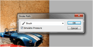
  20. Then, right click on the path and then select “Stroke Path”. If this is grayed out, this might mean that you do not have your new layer selected. Simply select that layer and you should be able to access the stroke path option. Also make sure that you still have your favorite grunge brush in white color selected now.


  21. Then, on the next window that opens, make sure that the Brush item is selected and press Ok.


  22. You will then see the grunge brush get stroked into the path. Now, press CTRL+T and then resize this brush stream so that it looks like it flows from the top to the bottom going through our cards. Right click on the transform box and either choose from “warp” and “scale” to achieve something like the image below.


  23. Then duplicate the stream several times and make thinner variations of the flow. This gives us a better flowing ink and grunge stream flowing from the top to our grunge brushes through the cards.


  24. Then, merge the stream layers together. Duplicate it and then re-orient and warp the duplicate for the bottom as the grunge brushes flow out.


  25. Now, using the type tool we write in our poster title. Use a white color for now. Be creative with your fonts when possible.


  26. Now, double click on a text layer to access its blending options/layer styles. First click on the main blending options and change the fill opacity to 20%.


  27. Then click on “Drop Shadow” and set these values: a. Angle: 45 degrees b. Distance: 15


  28. Afterwards, click on Inner shadow and use these settings: a. Opacity: 30% b. Angle: 45 degrees c. Distance: 4px d. Size: 5px


  29. Next, Check the outer glow options. Use these values: a. Opacity: 100% b. Color: Deep red c. Size: 21


  30. Next, click on Inner glow and use these settings: a. Color: Light red b. Size: 25px


  31. Lastly, click on “Color Overlay” apply a red color.


  32. Once you apply this to all our text layers, you should get something like this:


  33. Next, for a few final touches, paste in an image of clouds just on top of our background layer like so.


  34. The, desaturate the layer by pressing CTRL+SHIFT+U. Afterwards change the blend mode to multiply and reduce the opacity to around 35%.


  35. As the final effect to make things look vintage, go to Layer -> New Adjustment Layer -> Photo Filter. Move this adjustment layer on top of all the other layers. Then change the color to black and the density to 50%.


  36. Great! That finishes up our Vintage Car Grunge Poster design. Hope you have learned some great tricks.


  37. For more tips and tricks on Graphics Design, check out Printplace.com's tutorial section.

Popular Posts