Welcome To My Blog!

Basic and Advance Photoshop tutorials, Illustrator tutorials, tips and tricks for effective graphic designs, and other how-to guides.

Search This Blog

Loading...

Tuesday, May 22, 2012

How to Create a Cool Dance Party Flyer in Photoshop

Want to impress people with a colorful and credible flyer for your dance party? We will teach you some of the best and most simple tricks in Photoshop you can easily follow and apply for cool dance party flyers or event posters that are practically ready to print. Just carefully follow the steps below and you will see how it works.

  1. First, you will want to setup your document properly. Once Adobe Photoshop is open, create a new document by going to File -> New… Once the new document window is open, setup the dimensions. We will make this simple for you so that you can even print this either with a professional printer or in your printer at home. So we set the dimensions to half a letter size. These are the values you need to enter. a. Width: 8.5 b. Height: 5.5 c. Resolution: 300 d. Color Mode: CMYK


  2. Great! Now, before anything else setup your guidelines. Bring up the rulers (if they are not already up) by pressing CTRL+R. Create guidelines from the rulers by just click dragging the lines using the mouse, moving them to the canvass. Set a 0.25 inch guideline from the edges of the document to setup your bleed area. Make sure to set it up in all side of your document.


  3. Good. Now we will work on the background. First full our background with black using the Paint Bucket Tool. The inscribe a light grey circle using the Circle Shape tool. To make it a perfect circle, be sure to hold down the shift key as you create the shape. Size it so that it covers approximately the top part of the height of our design within the boundaries of the bleeds.


  4. Now, here is a nice little trick. First duplicate our circle by pressing CTRL+J. Change the duplicate’s color to a darker gray. Next, press CTRL+T to start transforming this duplicate. Then, press and hold both the SHIFT and ALT keys and reduce the size of the circle by click dragging the corner anchor points. Reduce the size of the circle by a few pixels and then press Enter to commit the transformation.


  5. Merge both our circle layers. Easily do this by selecting them both in the layers panel, right clicking on them and selecting the option to “Merge layers”. Once done, use a large soft eraser to remove parts of the circles, turning them into almost a crescent shape like so.


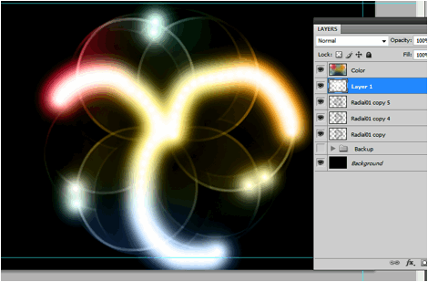
  6. Now, we will create a radial pattern effect. To do this, duplicate our half circle layer (CTRL+J) and then press CTRL+T to transform and rotate it. Move the rotation reticule to the bottom center of the shape and then start rotating the duplicate of our shape to the right. Hold down the SHIFT key so that the rotation is done in constrained values of 15 degrees. Rotate it twice for a 30 degree rotation.


  7. Do this several times until you complete our background radial pattern. Group these together in a layer group so that they are easier to manipulate.


  8. Duplicate the radial pattern group that we created by right clicking on the group and selecting “duplicate group” in the context menu. Then, transform the duplicate by pressing CTRL+T. Right click on the shape once it is in the transform mode. In the context menu select the option “Flip Horizontal”. This will give us a better flower radial pattern for our background.


  9. Good! Now, we duplicate both those groups and place them into a backup group. Hide the backup group now just in case you make mistakes. Then, merge the original groups into one. Erase some parts of the edges of our pattern for some variation. Then enlarge and rotate this image to match the needs of our flyer design.


  10. Create a new layer on top of our pattern layer. Press CTRL+SHIFT+N to do this quickly. Name this “colors”. Then, paint your theme colors with large soft brushes on this layer. Do this randomly in the layer.


  11. Then, just change the blend mode to “Color” so that your color layer applies its colors to the other layers.


  12. Great! Now, let us add more amazing patterns. Duplicate our pattern layer two times by pressing CTRL+J two times. Select the second copy you created. Transform and rotate it again clockwise or counter clockwise as you wish. Remember that you can use the SHIFT key to constrain the rotation at regular intervals. Do this until you get an interesting pattern. Change the blend mode of this layer to “hard light” to add some interesting variation to the color and pattern effect.


  13. Finally to add some more highlights, create a new layer again on top of our radial patterns. Then using a smaller soft WHITE brush pain some white spots on the lines in the patter that you want to be brighter.


  14. Change the blend mode of our white spots layer to “overlay” and you will see the highlights of white appear in your pattern.


  15. As a final addition to our background, we add in a Bokeh Image just on top of our black background layer. We change its blend mode to “Screen” and adjust its opacity to around 40%. With this, our background is ready.


  16. Now, we start processing our foreground image. We are going to use this wonderful dancing model image from Luca_76 in flickr. http://www.flickr.com/photos/luca76/6317801871/ We used a mixture of the “Magic wand tool” and the magnetic lasso tool to remove the background of the model.


  17. Great! Now, before we paste in our dancer to the main design, we will process her first with some creative splatters. To do this, we will use a special filter in Photoshop, the displace filter. However to make it work, you need to prepare a couple of image textures in PSD format. For our design we used these free textures from morguefile. Just save the textures that you want in PSD format in an easily accessible file folder location. a. http://www.morguefile.com/archive/display/723307 b. http://www.morguefile.com/archive/display/10850 c. http://www.morguefile.com/archive/display/726570 d. http://www.morguefile.com/archive/display/723303


  18. With the PSD textures ready, duplicate our dancing female layer by pressing CTRL+J. Afterwards, go to Filter -> Distort -> Displace. Choose the defaults on the window that opens and press OK.


  19. Once you click on OK, you will be asked to find the psd file for the texture. Just choose one of the four we converted earlier. Once chosen, you will see the duplicate image distorted by our texture. D0 not worry about the face being too distorted, we shall correct this.


  20. Just experiment with 1-4 texture inputs and try to get a nice splattered appearance.


  21. Great! Now remember that we are distorting the duplicate here right? Select the duplicate and look at the bottom of the layers panel for the “Add Layer Mask” option. Using a soft and black round brush, we erase parts of the face and limbs of our model, whilst leaving the splattered areas.


  22. Great! Now we just paste in both layers to our main flyer design. Press CTRL+T with both layers selected to scale up or down the model image as needed. Again take note that you can hold the SHIFT key as you scale them to make sure you preserve the aspect ratio.


  23. Now would be the best time to write in your title or slogan for your flyer. Just use the text tool to type in the title that you want. Of course, choose a creative font style that fits your theme. Use a white color for our text though. Change the blend mode of this text layer to “hard light” and then reduce its opacity to 70%. Position the text layer just above the pattern layers.


  24. Finally, just continue on writing the details for your flyer. This time, for the text, change the blend mode to “pin light” and reduce the opacity to 70%.


  25. Great! Now, as a final polish. We will integrate our model better with the color theme of our image. First, if you are happy with the splatter combination, merge both the original image and the splatter image together. Then create a new layer on top of it by pressing CTRL+SHIFT+N. In the new layer window that opens, make sure to click on the option “Use Previous Layer to create a Clipping mask.


  26. Once the new layer is set with a clipping mask, use the Gradient Color tool to inscribe a color gradient into the model’s shape only. Make sure of course to choose theme colors for your gradient color choices. 3-4 colors are recommended.


  27. Finally, change the blend mode of this layer to “Overlay”. This should give you a nice colored effect to our image. If you used the prevailing color theme of your image, your model should integrate well with the original design.


  28. Congratulations! With the gradient done, you should have finished our cool and creative dance party flyer.


For more tips and tricks on Graphics Design, check out Printplace.com's tutorial section.

Monday, May 21, 2012

Creating Your Own Heavy Metal Styled Posters With Photoshop

Do you need a more grungy and heavy metal style for your posters? Besides just pasting in random metal textures, there are a lot of ways that you can add that grungy metallic style. Here in this tutorial we will talk about not only putting metal textures into a poster. We will also discuss how you can turn your text styles into metal and integrate them creatively unto metal textures. So if you want to learn how to create your own heavy metal styled posters, here is the guide for you.

  1. The first step is to set your poster dimensions. Here is where some people get things wrong as they only look at the dimensions. While you can easily set the dimensions (width and height), many people pass over the resolution value. The resolution is important as it will determine the real quality of the design in printing posters. A minimum of 300ppi is recommended in fact for the best results. So once you create a new document in Adobe Photoshop, make sure that you set at least this value for your resolution, along with the poster dimensions that you want.


  2. With your new document open, the first step is to write your poster title. This will be the main feature of our heavy metal style poster. Just use Photoshop's text tool to write your desired title. Use a black color for your text for now and of course, choose a font style that matches your theme.


  3. Also, while this is not actually required, it is good to reduce the spacing or tracking within the characters. You can do this through the characters panel. If you do not see this, go to Windows->Character in the menu bar. Alternatively you can select a group of text and press CTRL+T to bring this up. Simply change the tracking value (AV icon) to something negative to bring the text closer together. Note that you can also change a lot of the text attributes in this panel. Play around!


  4. Now, we will create a metal feel for the text we just did. First, create a new group for our metal effect. Just click on the "Create New Group" icon in the layers panel. Name the group to label it appropriately as the layer to make our text look like metal. Here we named it "textmetal"


  5. Now, with our group layer selected, active the rectangular shape tool and inscribe a rectangle shape over part of our text. Do not worry if it goes out of the bounds of the text. Just make sure of course it is relatively covering the text properly. Note that once you let go of the shape tool, it automatically produces a shape layer within our newly created group. Use a grey color here (#333333).


  6. Now, keep creating more rectangles and squares. Think of these shapes as metal plates. Do not worry about going out of bounds of the letters, we will fix this soon enough. Just make sure you place in those rectangles as if they were plates. Follow the contour of the text when possible.


  7. Now, we are going to place in layer styles. Double click on one of your rectangle layer shapes. The layer styles window should open. We will be adding 4 types of layer styles or blending options. The first is the Drop Shadow. Click on this option. Adjust some of its values as follows: a. Opacity: 75% b. Distance: 0px c. Size: 13px d. Rest should be default.


  8. Then, click on the option ÒInner ShadowÓ. Change the values for this style like so: a. Opacity: 75% b. Distance 0px c. Size: 54px


  9. Now, click on ÒBevel and EmbossÓ. This helps make the shape look protruded or embossed of course. Change the following values: a. Depth: 1000% b. Size: 2 c. Rest should be default


  10. Then, add a gradient overlay by clicking on its checkbox. Change the parameters for this style as follows: a. Blend Mode: Screen b. Opacity: 15% c. Gradient Black to White. Check the box to reverse d. Style: Radial e. Rest should be default.


  11. You should see the effect get done in just ONE of our rectangles. To start apply them to all quickly, first right click on our layer and select the option to "copy layer style".


  12. Now, select all the rest of our rectangle shapes. Right click on them to bring up the context menu and then choose "Paste Layer Style". You should then be able to apply the metal plate initial style to all our rectangles.


  13. Great! Now we will shape those plates so that they only appear in the bounds of the text. To do this, first hold down the CTRL key and click on the layer thumbnail of our text. Here we are doing this for the ROCK text. You will see the area of the text get selected. Once you see the "marching ants" in the shape of the text, click on the layer group for text metal.


  14. Then, go to Layers -> Layer Mask -> Reveal selection.


  15. You should then see the plates get inscribed only in the selected area in the shape of the text. Repeat the process for all the text that you need.


  16. Now, we want to merge the groups. Just right click on the group folder and select "Merge Group". Of course make sure you already like the positions of the metal plates before you do this.


  17. Then, double click on the merged layers one by one. Apply the same Bevel and Emboss layer style settings that we used for the metal plates on these layers. This should make our text look more integrated.


  18. We are not yet done though. Those metal plates needs some "rivets" to make them look constructed together. To do this we create a new Group named rivets. Then using the Elliptical Shape Tool we draw in a very small light grey circle on one side of the plates. The size really depends on how big your design is. The key thing though is that you must hold the SHIFT key as you inscribe the circle so that the dimensions are constrained and you get a perfect circle for the rivet. Here we used a light grey (#999999) color.


  19. Now, before we multip7e the rivets, we will first add a couple of layer styles to it like the metal plates before. So double click on the this first rivet layer to get to the layer styles window. The first thing that you will want to apply is a drop shadow. Click on the checkbox and set these values. a. Distance: 0px b. Size: 5px


  20. Then click on Bevel and Emboss. Change the attributes of these values: a. Depth: 50% b. Size: 0px c. Highlight Mode Opacity: 100% d. Shadow Mode Opacity: 100%


  21. Finally, click on the Gradient Overlay. Use these values for the settings. a. Opacity: 40% b. Gradient Color: Black-to-White c. Style: Radial d. Angle: 90 degrees e. Scale: 135%


  22. Once done, zoom out and you will see the look of the rivet like this.


  23. Now, all you have to do is to duplicate this rivet for all our metal plates. To make the process easier, you can just use the ALT key. Simply press and hold the ALT key to quickly duplicate the rivets several times and place them appropriately on the corners of the plates.


  24. After some patient effort, you should have something like this. Once you are happy with the placement of the rivets merge the groups just like what we did with the metal plates.


  25. Now, to start fully realizing our design, we paste in a metal texture for the background.


  26. Now, we will match the color of our texture a bit with our text. There are many ways to do this, but to make things easier and just tone down some of the more intense colors in our texture, we just use a Photo Filter adjustment. Do this by going to Image -> Adjustments -> Photo Filter. Use a black color at 80% density.


  27. Now, we are going to merge our title layers into one layer so that we can apply an integrated effect to them. So select all our rivet layers and the metal plate layers and then right click on them. In the menu that opens, click on "merge layers".


  28. Double click on this new merged layer to bring up its layer style. Tick on the option for Bevel and Emboss. We are going to make the text look embedded in our grungy metal layer. Set these settings for the Bevel and emboss. a. Style: Pillow Emboss b. Depth: 1000% c. Size: 10px d. Soften: 1px


  29. You should now have this kind of effect:


  30. Now, we will add a few finishing touches. Create a new layer by pressing CTRL+SHIFT+N. Then using some grunge spray paint brushes, we place in several splatters around our title and the poster. Once set, we change the blend mode of the spray paint layer to ÒOverlayÓ to make the spray paint effect look better unto the metal.


  31. Lastly, go to Layers -> New Adjustment Layer -> Gradient MapÉ Set the gradient color map to purple-yellow.


  32. Finally, reduce the opacity of the adjustment layer to 30%.


  33. Great! Now we have our grungy heavy metal style poster! Note that you can add of course any other text layers below the adjustment later for other poster details. Just customize as you see fit.


For more tips and tricks on Graphics Design, check out Printplace.com's tutorial section.

Popular Posts