
Do you need a more grungy and heavy metal style for your posters? Besides just pasting in random metal textures, there are a lot of ways that you can add that grungy metallic style. Here in this tutorial we will talk about not only putting metal textures into a poster. We will also discuss how you can turn your text styles into metal and integrate them creatively unto metal textures. So if you want to learn how to create your own heavy metal styled posters, here is the guide for you.
- The first step is to set your poster dimensions. Here is where some people get things wrong as they only look at the dimensions. While you can easily set the dimensions (width and height), many people pass over the resolution value. The resolution is important as it will determine the real quality of the design in printing posters. A minimum of 300ppi is recommended in fact for the best results. So once you create a new document in Adobe Photoshop, make sure that you set at least this value for your resolution, along with the poster dimensions that you want.
- With your new document open, the first step is to write your poster title. This will be the main feature of our heavy metal style poster. Just use Photoshop's text tool to write your desired title. Use a black color for your text for now and of course, choose a font style that matches your theme.
- Also, while this is not actually required, it is good to reduce the spacing or tracking within the characters. You can do this through the characters panel. If you do not see this, go to Windows->Character in the menu bar. Alternatively you can select a group of text and press CTRL+T to bring this up. Simply change the tracking value (AV icon) to something negative to bring the text closer together. Note that you can also change a lot of the text attributes in this panel. Play around!
- Now, we will create a metal feel for the text we just did. First, create a new group for our metal effect. Just click on the "Create New Group" icon in the layers panel. Name the group to label it appropriately as the layer to make our text look like metal. Here we named it "textmetal"
- Now, with our group layer selected, active the rectangular shape tool and inscribe a rectangle shape over part of our text. Do not worry if it goes out of the bounds of the text. Just make sure of course it is relatively covering the text properly. Note that once you let go of the shape tool, it automatically produces a shape layer within our newly created group. Use a grey color here (#333333).
- Now, keep creating more rectangles and squares. Think of these shapes as metal plates. Do not worry about going out of bounds of the letters, we will fix this soon enough. Just make sure you place in those rectangles as if they were plates. Follow the contour of the text when possible.
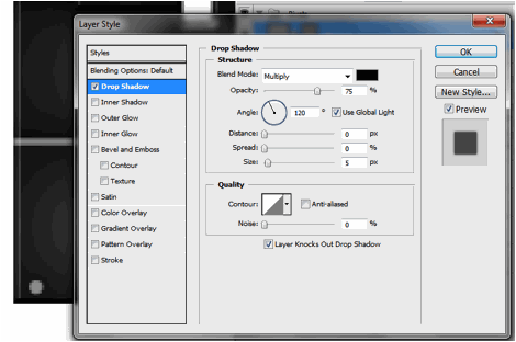
- Now, we are going to place in layer styles. Double click on one of your rectangle layer shapes. The layer styles window should open. We will be adding 4 types of layer styles or blending options. The first is the Drop Shadow. Click on this option. Adjust some of its values as follows: a. Opacity: 75% b. Distance: 0px c. Size: 13px d. Rest should be default.
- Then, click on the option ÒInner ShadowÓ. Change the values for this style like so: a. Opacity: 75% b. Distance 0px c. Size: 54px
- Now, click on ÒBevel and EmbossÓ. This helps make the shape look protruded or embossed of course. Change the following values: a. Depth: 1000% b. Size: 2 c. Rest should be default
- Then, add a gradient overlay by clicking on its checkbox. Change the parameters for this style as follows: a. Blend Mode: Screen b. Opacity: 15% c. Gradient Black to White. Check the box to reverse d. Style: Radial e. Rest should be default.
- You should see the effect get done in just ONE of our rectangles. To start apply them to all quickly, first right click on our layer and select the option to "copy layer style".
- Now, select all the rest of our rectangle shapes. Right click on them to bring up the context menu and then choose "Paste Layer Style". You should then be able to apply the metal plate initial style to all our rectangles.
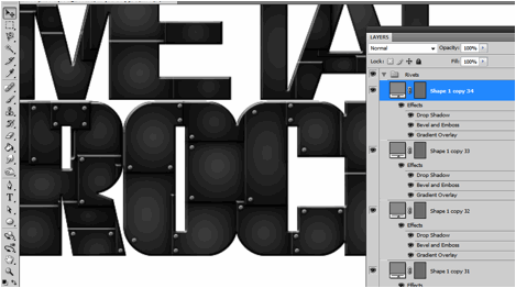
- Great! Now we will shape those plates so that they only appear in the bounds of the text. To do this, first hold down the CTRL key and click on the layer thumbnail of our text. Here we are doing this for the ROCK text. You will see the area of the text get selected. Once you see the "marching ants" in the shape of the text, click on the layer group for text metal.
- Then, go to Layers -> Layer Mask -> Reveal selection.
- You should then see the plates get inscribed only in the selected area in the shape of the text. Repeat the process for all the text that you need.
- Now, we want to merge the groups. Just right click on the group folder and select "Merge Group". Of course make sure you already like the positions of the metal plates before you do this.
- Then, double click on the merged layers one by one. Apply the same Bevel and Emboss layer style settings that we used for the metal plates on these layers. This should make our text look more integrated.
- We are not yet done though. Those metal plates needs some "rivets" to make them look constructed together. To do this we create a new Group named rivets. Then using the Elliptical Shape Tool we draw in a very small light grey circle on one side of the plates. The size really depends on how big your design is. The key thing though is that you must hold the SHIFT key as you inscribe the circle so that the dimensions are constrained and you get a perfect circle for the rivet. Here we used a light grey (#999999) color.
- Now, before we multip7e the rivets, we will first add a couple of layer styles to it like the metal plates before. So double click on the this first rivet layer to get to the layer styles window. The first thing that you will want to apply is a drop shadow. Click on the checkbox and set these values. a. Distance: 0px b. Size: 5px
- Then click on Bevel and Emboss. Change the attributes of these values: a. Depth: 50% b. Size: 0px c. Highlight Mode Opacity: 100% d. Shadow Mode Opacity: 100%
- Finally, click on the Gradient Overlay. Use these values for the settings. a. Opacity: 40% b. Gradient Color: Black-to-White c. Style: Radial d. Angle: 90 degrees e. Scale: 135%
- Once done, zoom out and you will see the look of the rivet like this.
- Now, all you have to do is to duplicate this rivet for all our metal plates. To make the process easier, you can just use the ALT key. Simply press and hold the ALT key to quickly duplicate the rivets several times and place them appropriately on the corners of the plates.
- After some patient effort, you should have something like this. Once you are happy with the placement of the rivets merge the groups just like what we did with the metal plates.
- Now, to start fully realizing our design, we paste in a metal texture for the background.
- Now, we will match the color of our texture a bit with our text. There are many ways to do this, but to make things easier and just tone down some of the more intense colors in our texture, we just use a Photo Filter adjustment. Do this by going to Image -> Adjustments -> Photo Filter. Use a black color at 80% density.
- Now, we are going to merge our title layers into one layer so that we can apply an integrated effect to them. So select all our rivet layers and the metal plate layers and then right click on them. In the menu that opens, click on "merge layers".
- Double click on this new merged layer to bring up its layer style. Tick on the option for Bevel and Emboss. We are going to make the text look embedded in our grungy metal layer. Set these settings for the Bevel and emboss. a. Style: Pillow Emboss b. Depth: 1000% c. Size: 10px d. Soften: 1px
- You should now have this kind of effect:
- Now, we will add a few finishing touches. Create a new layer by pressing CTRL+SHIFT+N. Then using some grunge spray paint brushes, we place in several splatters around our title and the poster. Once set, we change the blend mode of the spray paint layer to ÒOverlayÓ to make the spray paint effect look better unto the metal.
- Lastly, go to Layers -> New Adjustment Layer -> Gradient MapÉ Set the gradient color map to purple-yellow.
- Finally, reduce the opacity of the adjustment layer to 30%.
- Great! Now we have our grungy heavy metal style poster! Note that you can add of course any other text layers below the adjustment later for other poster details. Just customize as you see fit.


For more tips and tricks on Graphics Design, check out Printplace.com's tutorial section.


Nice tutorial on creating heavy metal styled posters. Effect in #29 is better than #33. I like it most. Thanks for this tutorial.
ReplyDeleteHi
ReplyDeletethis is very excellent tutorial for Photoshop. I would like to have your tutorials at my website also. So you can submit your tutorials at http://www.creativephotoshoptutorials.com/.
Thank you